


The Open Startup movement is growing in popularity, with many companies jumping on-board by operating in the open and sharing their statistics publicly. This is often done on dedicated page with various charts and numbers showing anything from revenue and users, to page views and losses.
At Leave Me Alone we are proud to be an Open Startup and share all of our metrics on our open page. We get a lot of questions about how we made this page so we decided to write a blog post about it!
Our open page is completely custom but it is pretty simple. This is a high level overview of how we have put it together. If you would like us to write an in depth code tutorial then please let us know!
But first, we gotta record the stats
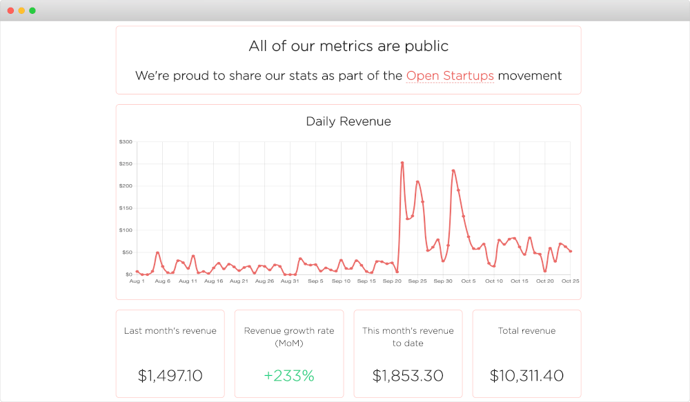
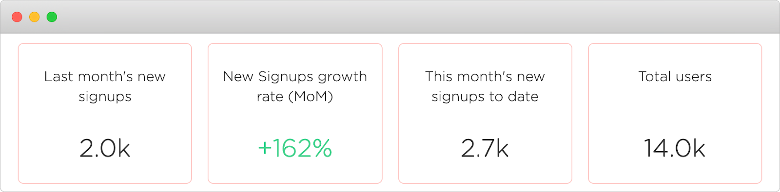
To call ourselves an “Open Startup” the only stat we really need to share is revenue, but we actually share a whole range of statistics because they are actually interesting for us to see - and we hope you find them interesting too!
Our open stats include; daily and monthly revenue, number of sales, expenses, new users, type of email provider, total emails processed, the number of subscription emails we have seen, and much more. When we launched Leave Me Alone we only showed a small number of these but we started collecting most of them from the beginning and slowly added them onto the page.
We record counts in three ways;
- Total values for the entire lifetime of the app. E.g. When a new user signs up we increment the "total users" number.
- Monthly values. For instance at the end of each month we record how much our monthly recurring revenue was at the end of that month so that we can show our MRR growth on a graph.
- Daily values. At the end of each day we record the number of events that happened that day so that we can show them on our daily graphs.
To record the daily and monthly stats we use an automated scheduler (called a cron job) to calculate the values daily/monthly and save those for later use.
Now we’re talkin’
We show almost all of our stats on the open page. We also use a subset of them on our landing pages for social proof, such as the total number of users and emails they have unsubscribed from under the main signup button on the homepage.

This helps new visitors see that we already have a large number of users, who have successfully unsubscribed from hundreds of thousands of emails. In marketing terms this is useful in order to create a fear of missing out (FOMO) for the visitor - other people are using this, so I should sign-up and use it too!
On our open page itself, we fetch all of the historical daily and monthly data and manipulate it to show various stats.
We have a lot of month on month (MoM) stat boxes calculated like so:
growthRate = (lastMonth - twoMonthsAgo) / twoMonthAgo
We then show the total number of last month's value and what percentage increase or decrease it was compared to the month before.
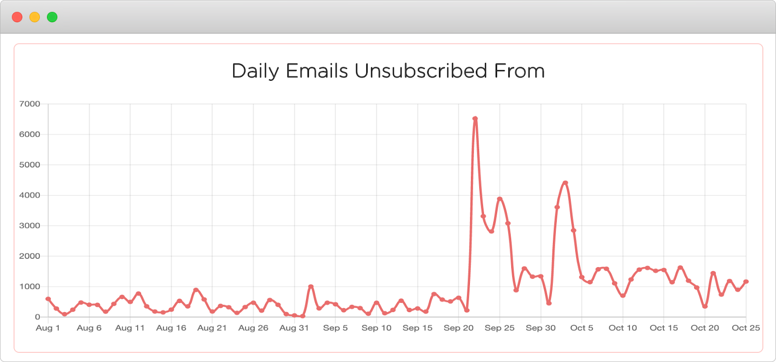
There are several line charts which are just the values for each day of the month. This one shows the total number of emails our customers have unsubscribed from each day.
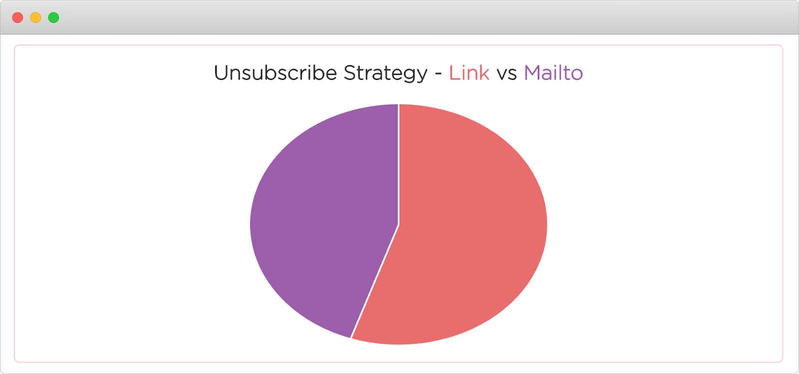
There is one pie chart that compares the type of unsubscribes performed. When you click unsubscribe we don’t have access to the content of your emails, but we do have a link or email address we can use to unsubscribe you. If there is a link then we follow it, otherwise we send an email on your behalf to the mailing lists unsubscribe address. We click more links, but it's pretty close!
Finally, we have a bar chart showing our monthly profit. Profit is calculated like this:
profit = revenue - expenses - tree donations
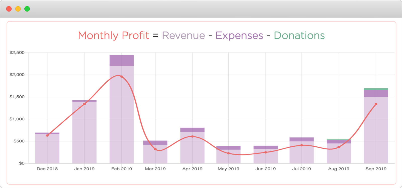
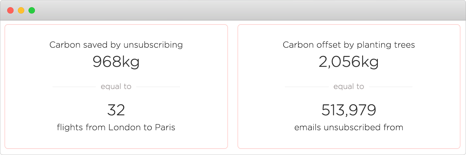
What is "tree donations" you ask? Well, unsubscribing from emails actually reduces your carbon footprint! We have a section that shows the total number of trees we have planted from customer donations and also the amount of carbon offset from unsubscribing. These are compared to some common activities like taking a flight to make the information easier to digest.
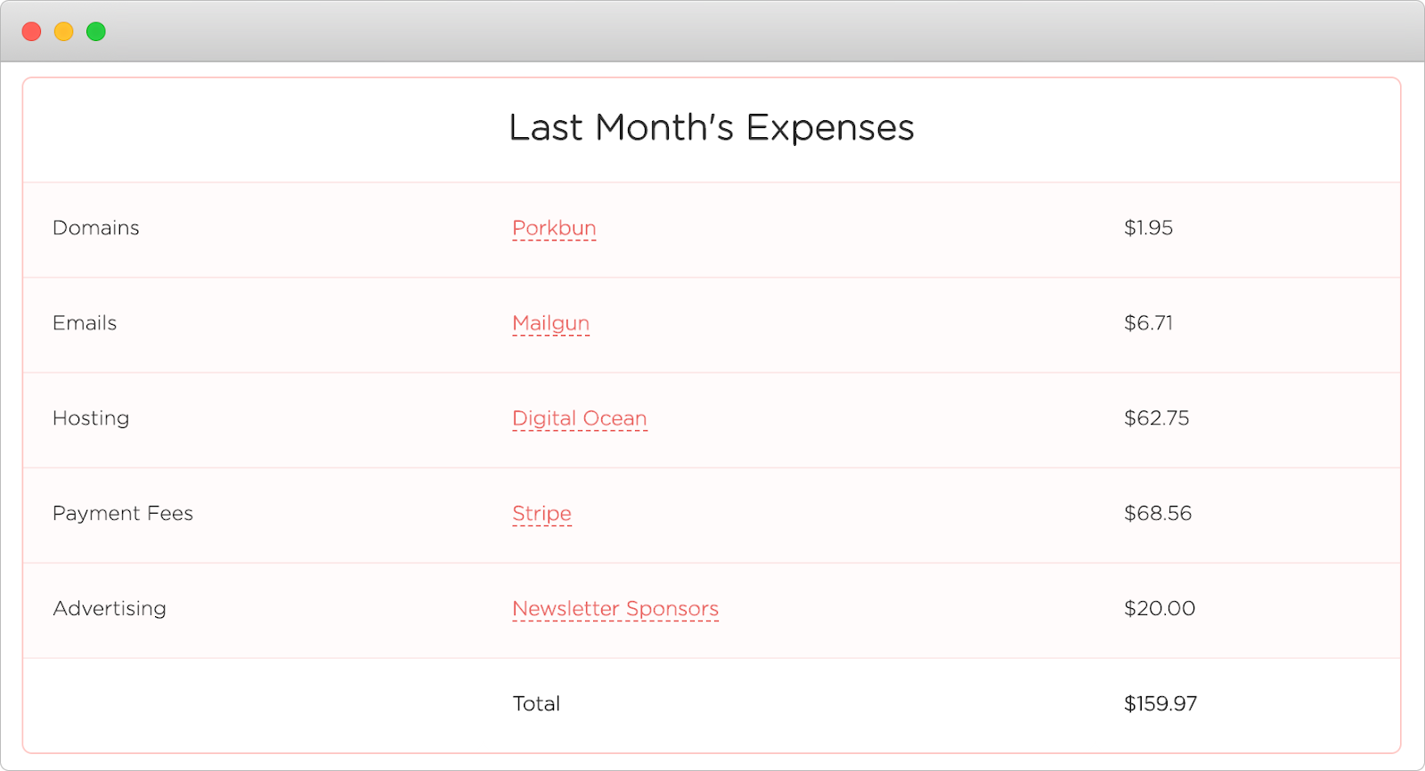
We are completely open about everything so we also show our expenses. This information is powered by Airtable. If you haven’t heard of it, then it’s like Google Sheets but on steroids! We use Airtable for a bunch of stuff like this. We track our expenses in an Airtable spreadsheet and then we import it onto our open page. This allows us to make changes to our expenses and add new ones each month without having to change the code.
That’s all there is to it! For any developers reading this, the website is built using Gatsby and React, the charts are Chart.js, and the layout is all CSS Grid.
We take payments with Stripe so we could have used their API for the revenue, but we decided to record all of our stats ourselves to be in total control of the data we were showing. This means we also listen to Stripe events for refunds and churn, and deduct them from our stats too.
I hope this has given you some ideas for your own open page!
As always, you can see all of our stats on our open page!
Thanks for reading.
Cover photo from Unsplash
